UX/UI
Quarter Steakhouse App
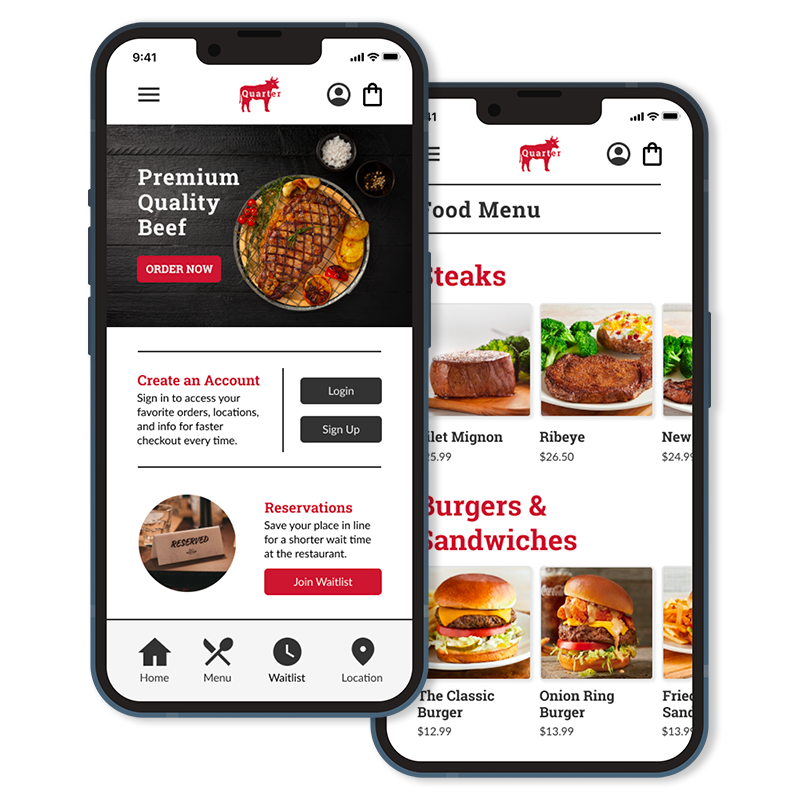
Case Study: A mobile app for Quarter Steakhouse to customize and order food.
Project Overview
Project Duration: Dec. 2021 to Jan. 2022
Role: UX/UI Designer
Programs: Figma
The Problem:
Creating a competitive food app ordering system for customers while maintaining branding and increasing the overall user experience.
The Goal:
Our app will let users place to-go orders from their mobile device so that they can easily customize their order and increase ordering convenience. This will improve overall sales and customer satisfaction.
Understanding the User
User Research
I conducted interviews and created empathy maps to understand the users I’m designing for and their needs. A primary user group identified through research was working adults who don’t have time to cook meals.
This user group confirmed initial assumptions about Quarter’s customers, but research also revealed that time was not the only factor limiting users from cooking at home. Other user problems included obligations, interests, or challenges that make it difficult to get groceries for cooking or go to restaurants in-person.
Pain Points
Time
Adults have busy schedules and lives.
Accessibility
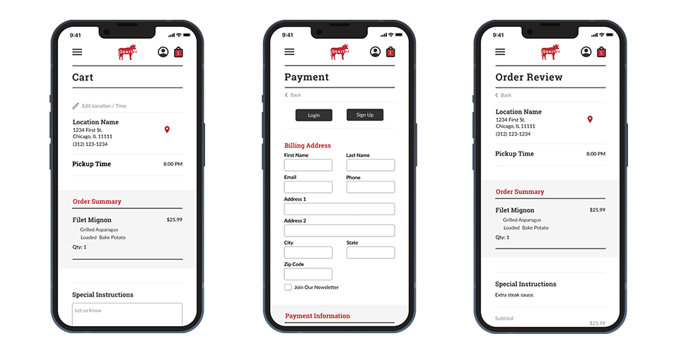
Inclusion of a special instructions box to accommodate food allergy requests.
IA
Text-heavy menus in apps are often difficult to read and order from.
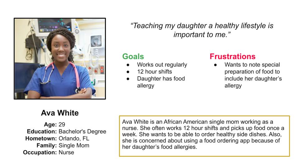
Persona: Ava White
Problem Statement: Ava is a busy, single parent of a child with food allergies, who needs to add allergy details to her order, so that the cooks prepare the food order safely.
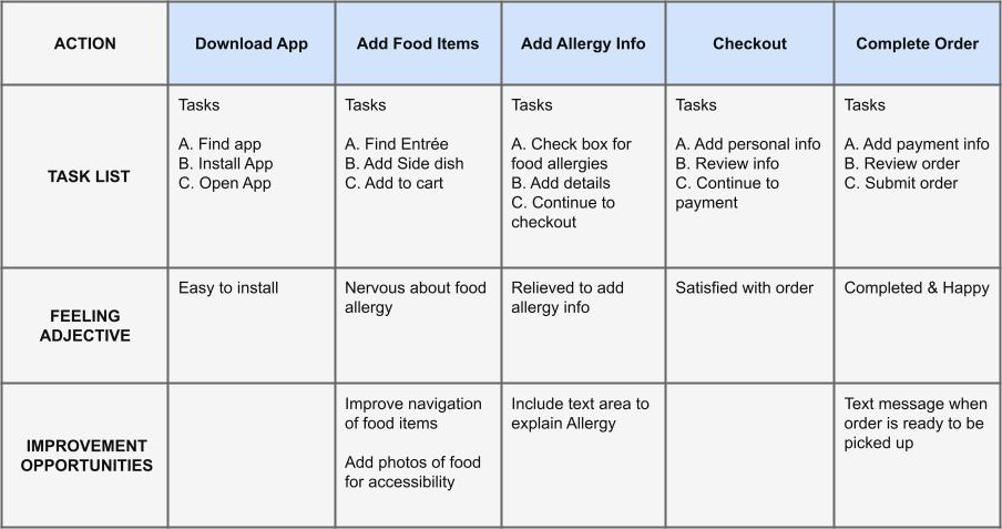
User Journey Map
Goal: Order dinner from the restaurant app and include the food allergy information.
Starting the Design
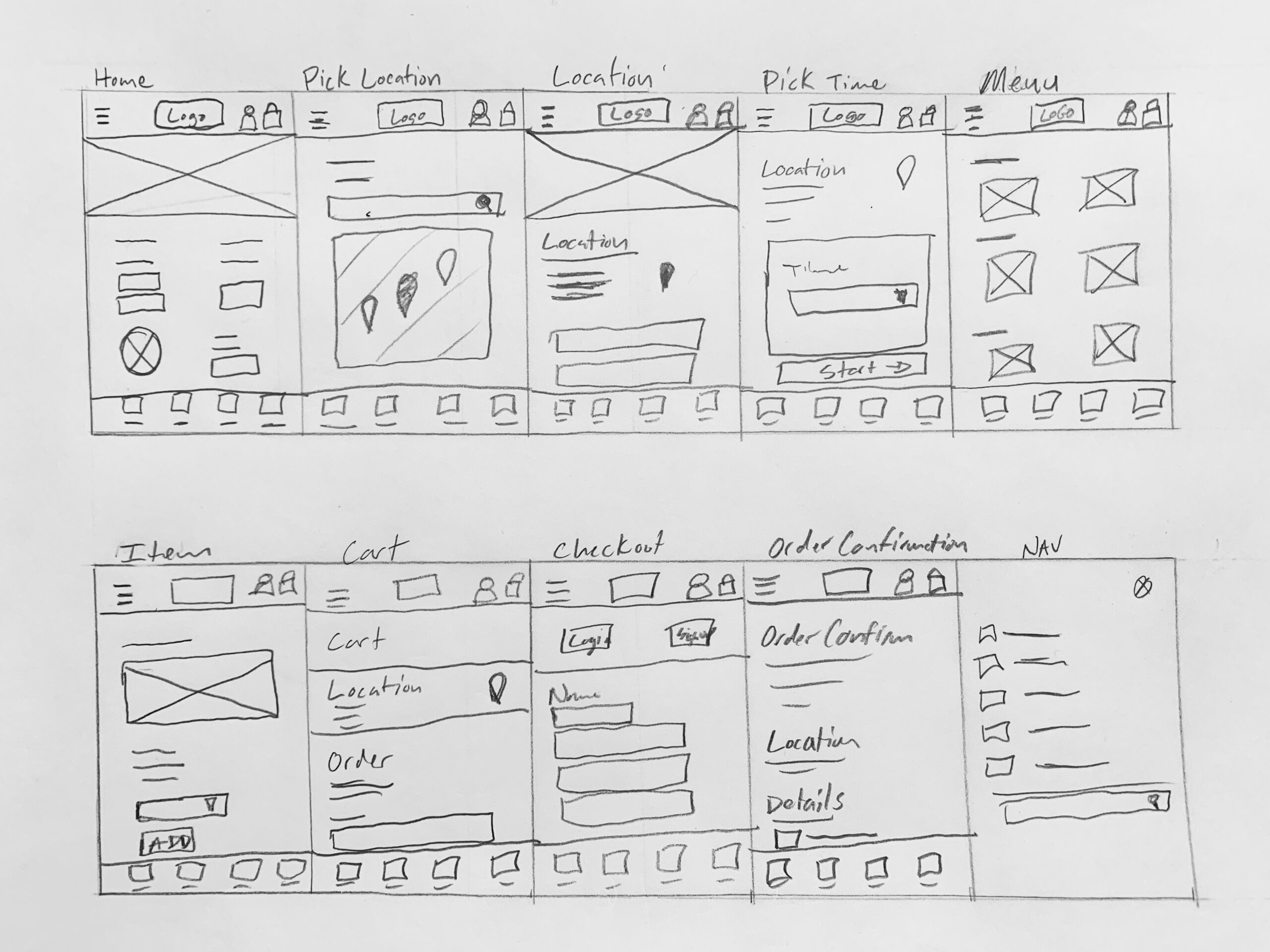
Low-fidelity Mockups
Taking the time to draft iterations of each screen of the app on paper ensured that the elements that made it to digital wireframes would be well-suited to address user pain points.

Low-fidelity Prototype
Using the completed set of digital wireframes, I created a low-fidelity prototype. The primary user flow I connected was building and ordering, so the prototype could be used in a usability study.
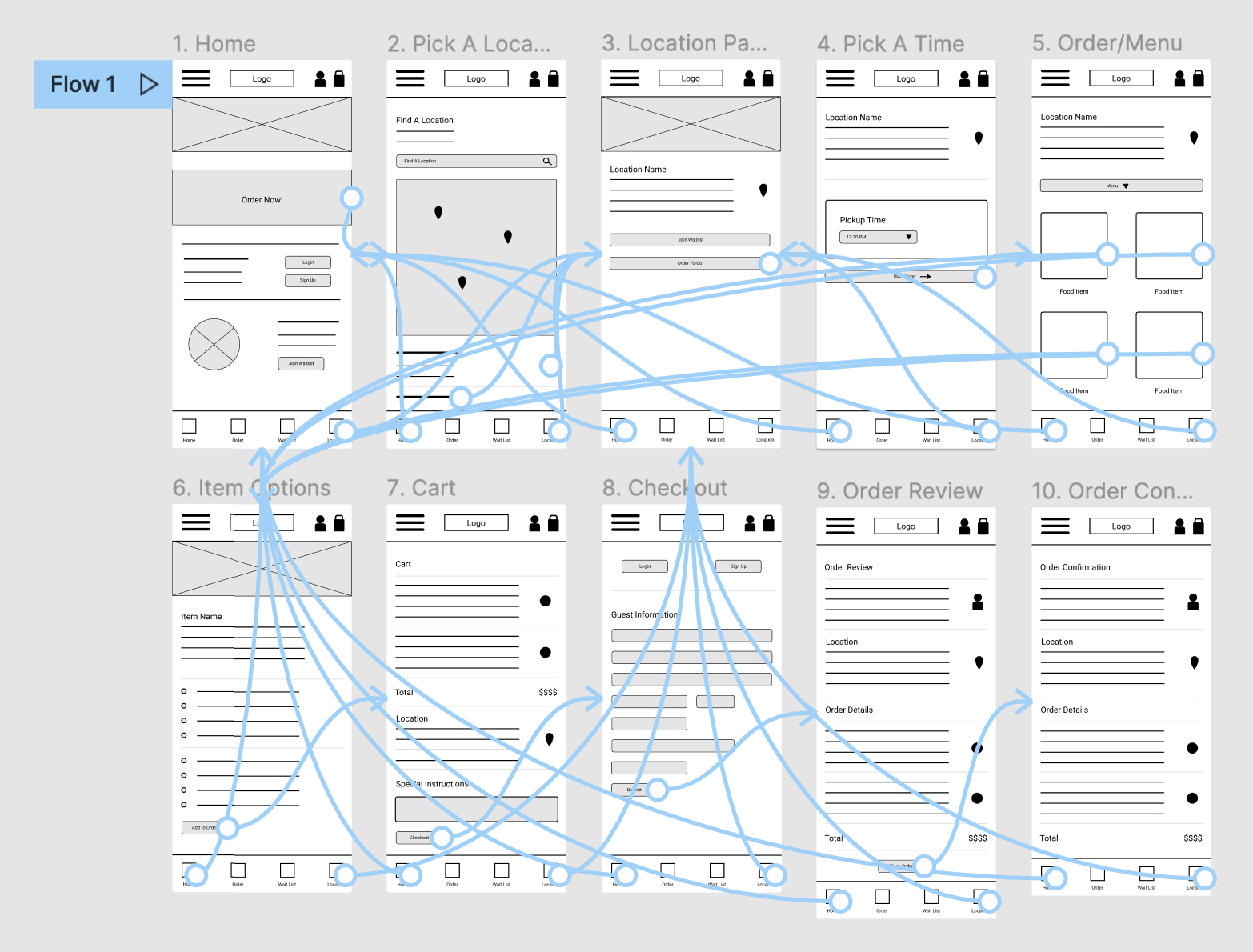 Lo-fi Prototype
Usability Study Findings
I conducted two rounds of usability studies. Findings from the first study helped guide the designs from wireframes to mockups. The second study used a high-fidelity prototype and revealed what aspects of the mockups needed refining.
Round 1
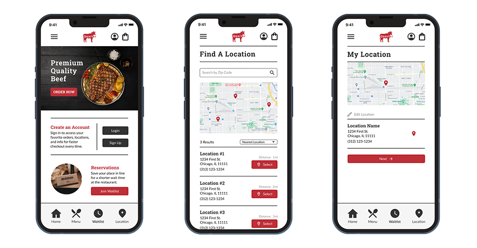
- User wants homepage order section
- User wants order review before checkout
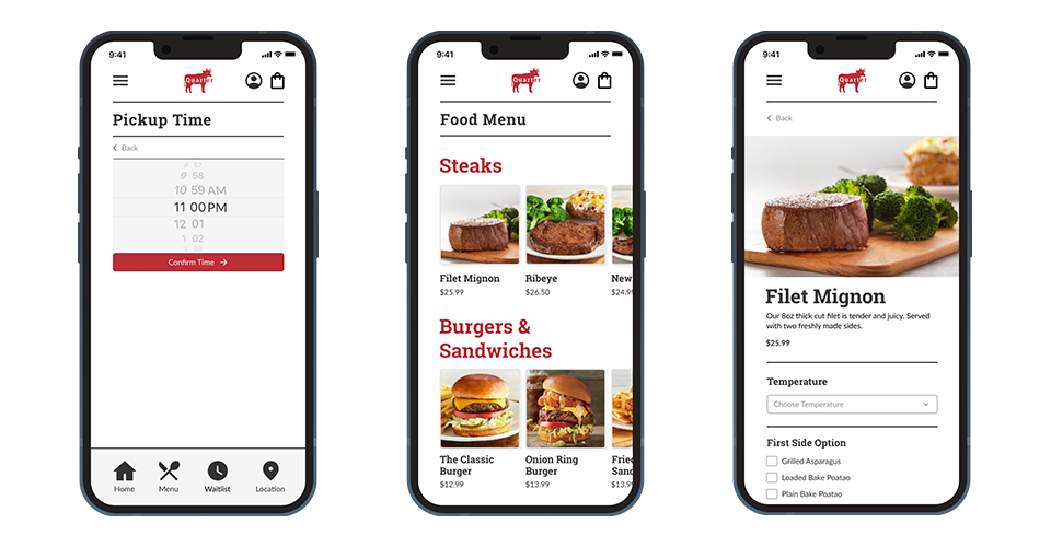
- User wants images of food items
Round 2
- User wants back arrows
- Users wants time picker
Refining the Design
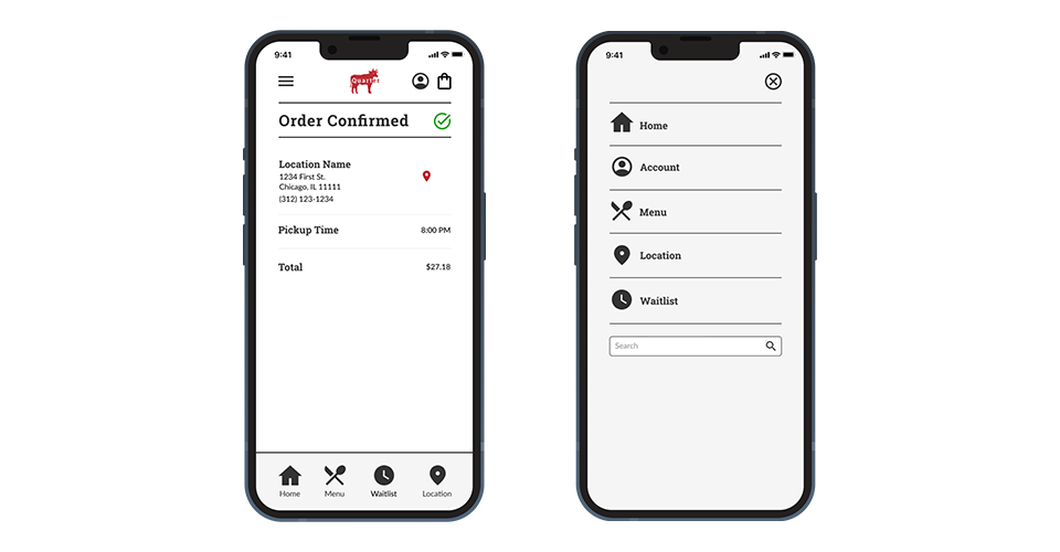
High-fidelity Mockups
High-fidelity Prototype
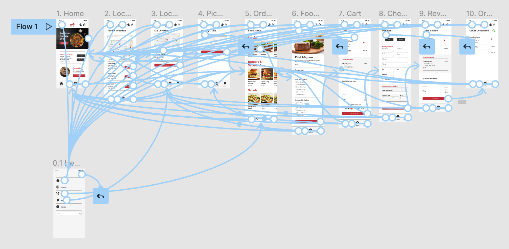 Hi-fi Prototype
Accessibility Considerations
Provided access to users who are vision impaired through adding alt text to images for screen readers.
Used icons to help make navigation easier.
Used detailed imagery for the food menu to help all users better understand the designs.
Takeaways
Impact
The app makes users feel like Quarter Steakhouse really thinks about how to meet their needs.
While designing Quarter’s app, I learned that the first ideas for the app are only the beginning of the process. Usability studies and peer feedback influenced each iteration of the app’s designs.
Thank you for your time reviewing my work on the Quarter Steakhouse app!
Slide Deck